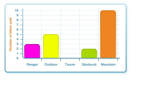
What is the most popular bike sold?
What is the least popular bike sold?
How many bikes were sold altogether?
What is the difference in the number of bikes sold between the most and least popular?
What title would you give this graph?
Use these sites to make your own bar chart:
http://www.bbc.co.uk/schools/ks2bitesize/maths/flash/interpretingdata.swf
http://www.amblesideprimary.com/ambleweb/mentalmaths/grapher.html
http://nces.ed.gov/nceskids/createagraph/default.aspx?ID=308c797f88cd41c1a80b96ea1bf3fe7c

the game is really fun
I liked when we were testing the solids and gas it was Brillient I liked it it was fun.
i liked doing graphs it was really fun and i enjoyed doing to day on the laptops
wow its amazing what you can do with data to keep you bisy I want to have a go.
I made a graph just now and I really enjoyed doing it.
i think it was brilliant doing the graphs it was exellent.
too fun